Week 7: Precision with the Pen Tool
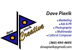
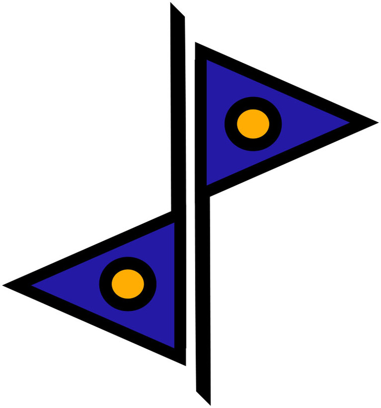
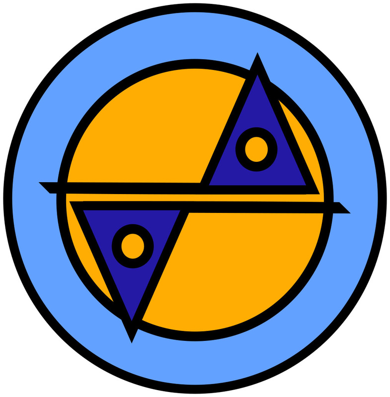
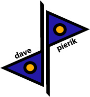
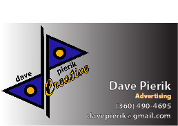
For the Business Card I was originally going to use the round logo with the yellow middle, but at the last minute I changed my mind because round logos are so common and I wanted the graphic "d" and "p" to stand out more. I felt that the "dp" was the strongest of the sketches. The gradient on the card and the orange "Advertising" were also late changes. I've been in advertising for years but I'm also a cellist and I do a lot of other things. But I didn't want to clutter the card up. Illustrator is really very flexible and I'm so much more accurate with the tools it offers compared to free hand art, it feels like I'm cheating.
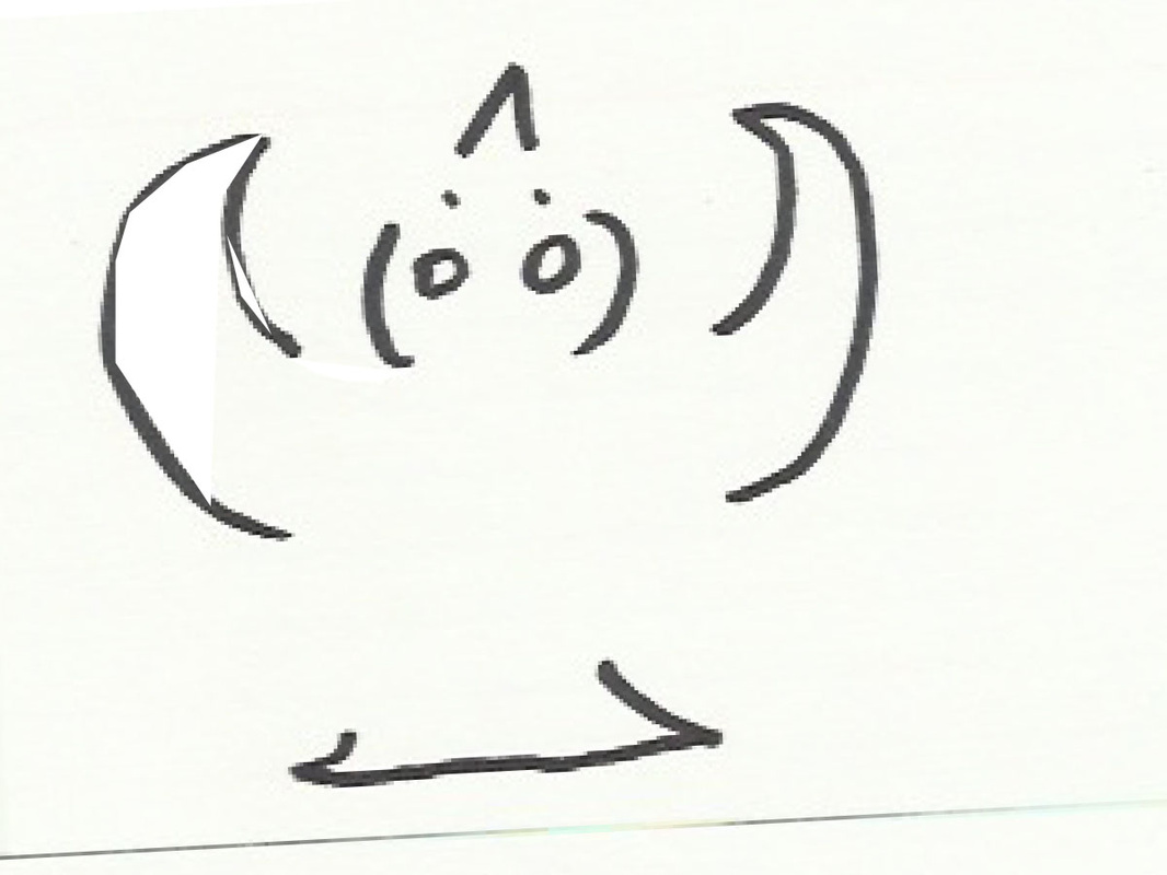
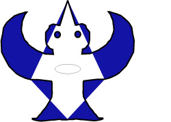
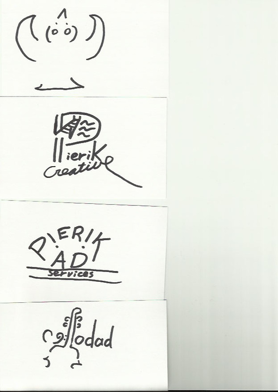
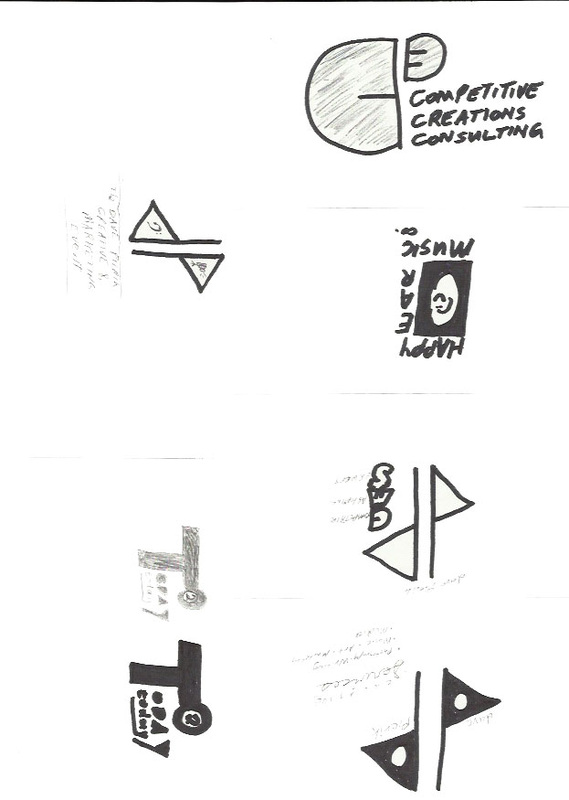
I had several hand-drawn pages of logo sketches elsewhere in a 9"x 12" hardbound art book. I couldn't find them and they are a bit old anyway so I redrew my starting ideas from some of my favorites I remembered, on index cards and scanned them. Thanks to this assignment I finally got around to getting my scanner set up and going. I had some more ideas but I didn't like them as well, for "cellodad" (an old stage name of mine) and this abstract bird image I've been working on.
I had several hand-drawn pages of logo sketches elsewhere in a 9"x 12" hardbound art book. I couldn't find them and they are a bit old anyway so I redrew my starting ideas from some of my favorites I remembered, on index cards and scanned them. Thanks to this assignment I finally got around to getting my scanner set up and going. I had some more ideas but I didn't like them as well, for "cellodad" (an old stage name of mine) and this abstract bird image I've been working on.