Three background abstracts based on tutorials
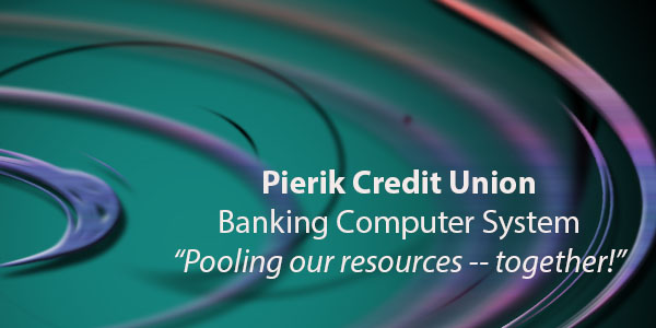
I was originally going to call my fictitious financial institution "Felix Federal" but I changed my mind. Looking at the background I came up with made me think of a pool and then I thought of pooling resources. I think it is a good blending of masculine and feminine color and style. It doesn't hurt that people think of green for money, but they want to put their finances "in the pink" and when you're doing well, you're "in the black." The background started from ideas and techniques from tutorial 1 but I changed it around quite a bit.
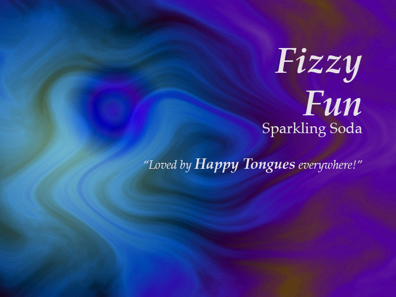
It's funny, I didn't have soda in mind when I put this one together. To be honest I had a difficult time getting the layers to do what I wanted and ended up re-doing tutorial 2 multiple times. So when I was getting ready to put it all together, I had several different layers to choose from and even though the main layer was more black with green streaks, I chose this one because it fit the idea better. It looks like a fun grape flavor, a bit like the "Fruit by the Foot" we've been eating around the house so much lately... Calling it Fizzy Fun was just spontaneous and when I was trying to come up with a slogan I imagined what it would taste like and I kind of rolled my tongue, thinking of an "L" shape and feel, which turned into the slogan above. I have no idea if I came up with that or it's something I heard somewhere else.
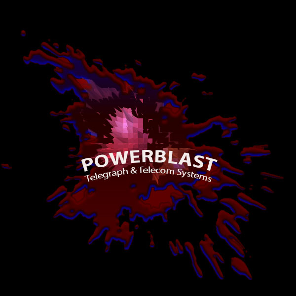
This background started out as Tutorial 3. Again, I was wrestling with the layers and playing around, during which I tried making the background red instead of black, but when I did that I was unable to apply the extrude command. But that was the layer I was able to get to do the "Plaster" effect to so I went back and put the background black, merged and fought with it until I was happy with the result.
Red and blue are favorite colors of mine but I didn't want it to be too crazy or distracting. For the brand I imagined a small cable company in a little town I used to work in years ago and what they would be doing right now to try to look modern, hence the new sounding first word, "POWERBLAST" and the archaic Telegraph and Telecom, which could easily happen if a new entity bought and rebranded an old local cable company. I added Systems to diversify the idea of what they would be offering to include things like high speed fiber optic and cell phone services.
Red and blue are favorite colors of mine but I didn't want it to be too crazy or distracting. For the brand I imagined a small cable company in a little town I used to work in years ago and what they would be doing right now to try to look modern, hence the new sounding first word, "POWERBLAST" and the archaic Telegraph and Telecom, which could easily happen if a new entity bought and rebranded an old local cable company. I added Systems to diversify the idea of what they would be offering to include things like high speed fiber optic and cell phone services.
Abstract works assignment notes:
Overall I very much enjoyed this assignment because I have been a lifelong student of advertising (aren't we all?) It's all around us and it really is very fun.
